[ newsletter ]
Stay ahead of Web3 threats—subscribe to our newsletter for the latest in blockchain security insights and updates.
Thank you! Your submission has been received!
Oops! Something went wrong. Please try again.
Learn about CSV export for risk reports, including key fields, formatting, and advanced options for comprehensive risk analysis.


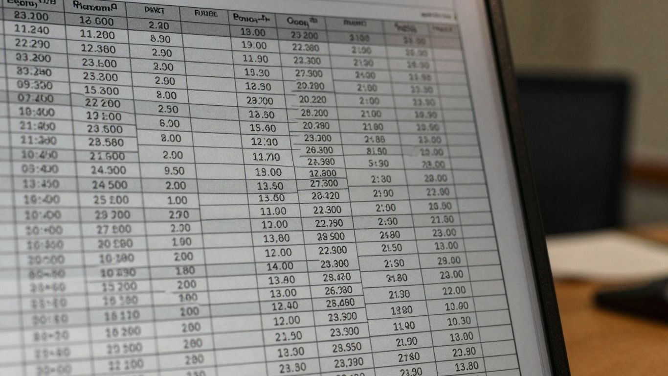
Exporting your risk data to a CSV file can be super handy for looking at things more closely. It’s like getting all your risk reports out of their usual format and into a spreadsheet where you can really dig in. This whole process, from figuring out what data to pull to making sure it’s organized right, is what we're going to chat about. We'll cover the important bits of information you’ll want in your csv export risk reports and how to set it all up so it actually makes sense when you open it.
When you're exporting risk reports to a CSV file, getting the right metrics is super important. It's not just about dumping data; it's about making sure the data actually tells you something useful about the risks involved. We need to figure out what numbers really matter and how to present them so they make sense.
First off, we need to pinpoint the key indicators that signal risk. Think about things like how old an account is, where transactions are coming from, or how mature a known vulnerability is. These aren't just random numbers; they're pieces of a puzzle that help paint a picture of potential problems. Identifying these core metrics is the foundation for any meaningful risk analysis.
Here are some common types of metrics we look at:
Raw data can be messy. You've got spikes, dips, and just general noise that can make it hard to see the real trends. That's where normalization and smoothing come in. Normalization basically puts all your metrics on a similar scale, so you're not comparing apples and oranges. Smoothing techniques, like using moving averages, help to iron out those short-term fluctuations. This way, you can see the underlying patterns more clearly.
For example, if you have a metric that jumps wildly one day but is usually stable, a moving average will help to show the general trend rather than getting thrown off by that single spike. It helps to make the data more consistent and easier to interpret over time.
Smoothing techniques are vital for reducing the impact of random variations in data. They help to reveal the underlying trends that might otherwise be obscured by short-term noise. This makes the data more reliable for making decisions.
Often, you'll have several different risk metrics. While each one tells a part of the story, it's usually more helpful to combine them into a single, overall risk score. This gives you a quick way to gauge the general risk level. Think of it like a credit score – it's a combination of many factors that boils down to one number.
Combining metrics requires a careful approach. You need to decide how much weight each individual metric should have in the final score. This is often based on how strongly each metric correlates with actual risk events. The goal is to create a score that accurately reflects the overall risk profile without being overly sensitive to any single data point.
When you're exporting risk data, picking the right fields is super important. It's not just about getting a dump of everything; it's about pulling out the specific pieces of information that actually help you understand and manage risk. Think of it like packing for a trip – you don't just throw everything in your suitcase, right? You pick the essentials. For risk reports, these essentials often fall into a few categories.
Understanding how long an account has been around and where its transactions are coming from gives you a baseline. New accounts or accounts with transactions from unusual places might need a closer look. It's a simple way to flag potential issues early on.
The age of an account, especially in digital systems, can be a strong indicator of its trustworthiness. Very new accounts often lack a history, making it harder to assess their behavior patterns and potential risks.
If you're dealing with software or smart contracts, knowing how severe a vulnerability is and how old the contract is matters. A critical vulnerability in a brand-new contract might be a red flag, while the same vulnerability in an older, well-tested contract might be less concerning (though still needs attention!).
This is about how ready an exploit is and how long the vulnerability has been sitting there. If there's a known, mature exploit for a vulnerability that's been around for a while, the risk goes up. It's like knowing a lock is weak and there's a key already made for it.
These fields help paint a clearer picture of the immediate threat landscape associated with specific vulnerabilities.
So, you've got your risk data all prepped and ready to go. Now comes the part where we make sure it's actually usable. Nobody wants a messy CSV file that looks like it was put together by a toddler. We need to think about how the data is presented, what types of data we're dealing with, and how to handle any gaps.
When you're exporting, it's super important to get the data types right. If you export a number as text, spreadsheets might try to do weird things with it, like sorting it alphabetically instead of numerically. This can really mess up any analysis you're trying to do later.
Here's a quick rundown of common data types and how they should ideally look in your CSV:
10, 0.75, 1500.High, Medium, Low, or Account ID: 12345.1/0, TRUE/FALSE, or Yes/No.Getting these right from the start saves a ton of headaches down the line. It's like making sure all your ingredients are prepped before you start cooking.
Dates and timestamps can be tricky. Different systems have different ideas about how dates should look. For a CSV export, consistency is key. You want a format that's widely understood and easy for software to parse. ISO 8601 is usually a safe bet, like YYYY-MM-DDTHH:MM:SSZ or just YYYY-MM-DD for dates.
Why does this matter? Imagine trying to sort transactions by date if half of them are 01/05/2023 and the other half are May 1, 2023. Your spreadsheet will get confused. Sticking to a standard format, like 2023-05-01, makes sure everything sorts correctly.
YYYY-MM-DDTHH:MM:SSZ (e.g., 2023-10-27T10:30:00Z)YYYY-MM-DD (e.g., 2023-10-27)1698395400). This is less human-readable but very precise for calculations.Choosing one consistent format for all your date and time fields will make your exported data much more reliable for analysis. It’s a small detail that makes a big difference when you're trying to validate every file before loading.
What happens when a piece of data just isn't there? You can't just leave a blank space, because that can be interpreted differently by different tools. We need a clear way to show that data is missing.
Common approaches include:
). This is simple but can sometimes be ambiguous.NULL, NA (Not Available), or N/A. This makes it very clear that the data is missing.Sometimes, the standard risk reports just don't cut it. You need more control, more detail, or maybe you want the data delivered in a specific way. That's where advanced export options come in handy. Think of it as customizing your toolkit for digging into risk data.
This is where you get to play architect with your data. Instead of just accepting what's given, you can build reports from the ground up. You decide exactly which metrics and fields make it into your CSV file. This is super useful for focusing on specific areas, like tracking development costs tied to code health or understanding how knowledge is spread across your teams. You can even set up reports that look at architectural-level data, not just individual files. It's all about tailoring the output to your exact needs.
Here's a quick look at how you might configure a custom report:
When you're setting up these custom reports, you'll run into a choice: do you want to look at data on a file-by-file basis, or do you want a higher-level view of your entire system or architecture? File-level data is great for pinpointing specific code issues, like a single function with high technical debt. Architectural-level data, on the other hand, helps you see the bigger picture, like identifying entire services that have high change frequency and might be prone to defects. Choosing the right level depends entirely on the questions you're trying to answer.
Manually running reports and exporting data can get old fast. The real power comes when you automate this. You can set up your custom reports to run on a schedule – daily, weekly, whatever works for you. And instead of having to log in and download them yourself, you can have them automatically emailed to you or your team. This keeps everyone in the loop without adding extra work. It's a simple way to make sure risk data is consistently flowing to the people who need it, keeping stakeholders informed.
Automating report delivery ensures that risk insights are consistently available, reducing the chance of critical issues being missed due to manual oversight or delays in data access.
So, you've got your risk report all exported as a CSV. Now what? It's not just about having the data; it's about making sense of it. This is where the real work begins, turning those rows and columns into actionable insights.
Looking at individual risk metrics is good, but seeing how they relate to each other is even better. Sometimes, a high score in one area might be amplified by a moderate score in another, or maybe two metrics that seem unrelated actually move together. Understanding these connections helps paint a clearer picture of the overall risk landscape. For instance, you might find that a high 'Exploit Maturity' score often goes hand-in-hand with a high 'Vulnerability Severity' score. This kind of pattern suggests a more immediate threat.
Here's a quick look at how some metrics might correlate:
If you're using a risk scoring model, the CSV export is your report card. You need to know if your model is actually doing a good job. This means looking at how well the scores in your CSV align with actual incidents or outcomes. Did your model flag projects that later experienced issues? Or did it correctly identify low-risk projects that remained stable?
Key performance indicators to consider include:
Evaluating your risk scoring model's performance is an ongoing process. The data you export provides the raw material for this evaluation. Regularly checking these metrics helps you fine-tune your model and trust its outputs more.
Ultimately, the goal is to do something with this information. The CSV export should lead to decisions. Maybe you need to allocate more resources to investigate certain types of vulnerabilities, or perhaps you can relax controls on areas that consistently show low risk. The data can guide:
By digging into the details of your exported risk data, you can move from simply knowing about risks to actively managing and mitigating them. It's about making informed choices that strengthen your security posture. You can use tools like FME to easily interpret this kind of data as a table of rows and columns before building any workflows [0391].

Getting the right data into your CSV is the first hurdle. You'll want to pull information directly from your risk assessment tools or databases. This often means writing scripts or using APIs to grab the raw numbers. Think about what you actually need. Do you want every single transaction, or just the aggregated risk scores? It's usually better to start with more data and filter later, but be mindful of file size.
Before you even think about CSV, you need to clean things up. This involves handling any weird characters, making sure dates are in a consistent format, and dealing with any missing values. If you have systems that output data in different ways, you'll need to standardize it. For example, if one system calls a risk level 'High' and another uses '3', you need to make them match.
Raw risk numbers can be all over the place. A score of 10 might be huge in one context but tiny in another. That's where normalization comes in. It's like putting all your scores on the same scale, usually between 0 and 1. This makes it easier to compare different types of risks.
Sometimes, you get really extreme values that can mess up your averages or comparisons. This is where winsorization is handy. Instead of just throwing out those super high or super low numbers, you cap them. For instance, you might say that anything above the 95th percentile just counts as the 95th percentile value. This keeps the data point but stops it from skewing your results too much.
Here's a quick look at how these might apply:
Manually exporting data is fine for a one-off, but for regular reporting, you need automation. This means connecting your CSV export process to your existing auditing tools or platforms. Many security and risk management tools have APIs that let you pull data programmatically. You can set up scripts that run on a schedule, grab the latest risk data, process it, and generate the CSV file automatically.
Think about setting up triggers. Maybe a new vulnerability is found, and that automatically kicks off a report generation. Or perhaps you want a daily digest of high-risk accounts. Integrating with these tools means your CSV reports are always up-to-date without you having to lift a finger. It also helps maintain consistency, as the same logic is applied every time.
So, we've gone over the different pieces of information you can pull out when exporting risk reports to CSV. It's not just about getting a file out; it's about making sure that file has the right details. Think about what you really need to see – is it the age of a risk, its severity, or maybe when it was last updated? Picking the right fields means your CSV export actually helps you understand and manage risks better, instead of just being a big list of data. Getting this right makes a difference when you're trying to keep things secure.
When you export risk reports as a CSV, you can get lots of useful details. This includes things like how old an account is, where transactions come from, how serious a vulnerability is, and how long a contract has been around. You can also see how mature an exploit is and how old a vulnerability is. It's like getting a detailed checklist of potential problems.
Formatting the data correctly is super important so that computers can understand it easily. This means making sure numbers are numbers, dates are dates, and that you don't have missing pieces of information. If it's not formatted right, the data can get mixed up, and you might miss important risks or get wrong information.
Think of 'normalization' like making all the numbers fit into a similar range, so you can compare them fairly. 'Smoothing' is like taking out the really jerky ups and downs in the data to see the general trend better. For risk reports, this helps us see the real risks without getting confused by tiny, unimportant changes.
Yes, often you can! Many systems let you create 'custom reports.' This means you can pick and choose exactly which pieces of information, or fields, you want to include in your CSV export. It's like building your own report card for risks, focusing on what matters most to you.
Advanced options can include setting up reports to be sent automatically by email on a schedule, or even getting reports that look at risks for a whole system (architectural-level) instead of just one file. Some tools also let you set up these custom reports across many projects at once.
Once you have the CSV file, you can use it to look for connections between different risks. For example, does a certain type of vulnerability often show up with older contracts? You can also use this data to check how well your risk-finding tools are working and to figure out what actions you need to take to make things safer.